Color Trends for 2026
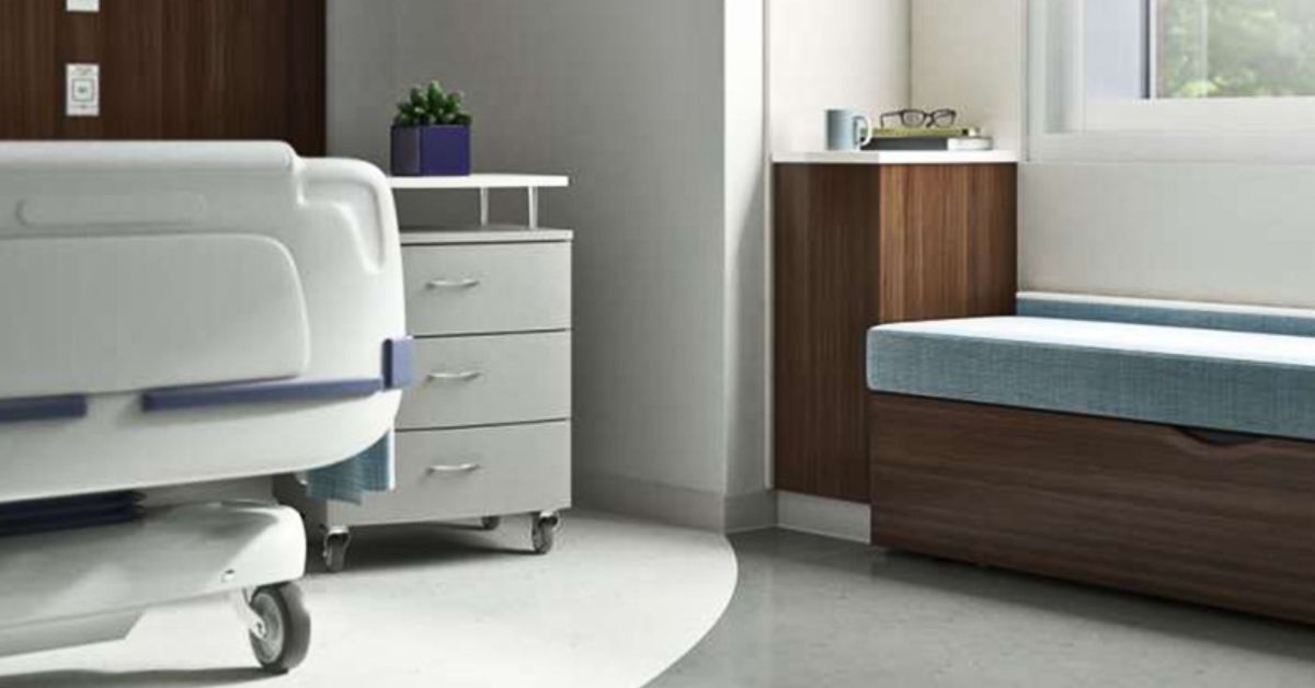
Healthcare Trends for 2026: Calm, Comfort, and Confidence
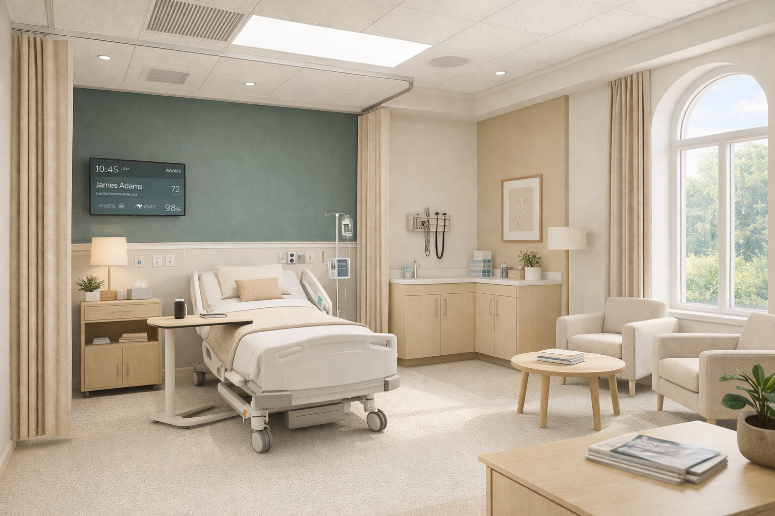
Healthcare environments in 2026 are moving away from stark, clinical design and toward spaces that actively support comfort and emotional well-being. Color is playing a major role in this shift, helping healthcare facilities feel more welcoming without sacrificing clarity or cleanliness.
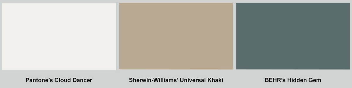
- Pantone’s Cloud Dancer introduces a soft, calming off-white that keeps spaces bright and clean without feeling harsh.
- Sherwin-Williams’ Universal Khaki adds warmth and familiarity, helping waiting areas and patient rooms feel more human.
- BEHR’s Hidden Gem, a deep smoky green, is being used in controlled moments to ground spaces and aid wayfinding.
In 2026, healthcare design isn’t just about efficiency; it’s about creating spaces that reduce stress and build trust from the moment someone walks in.
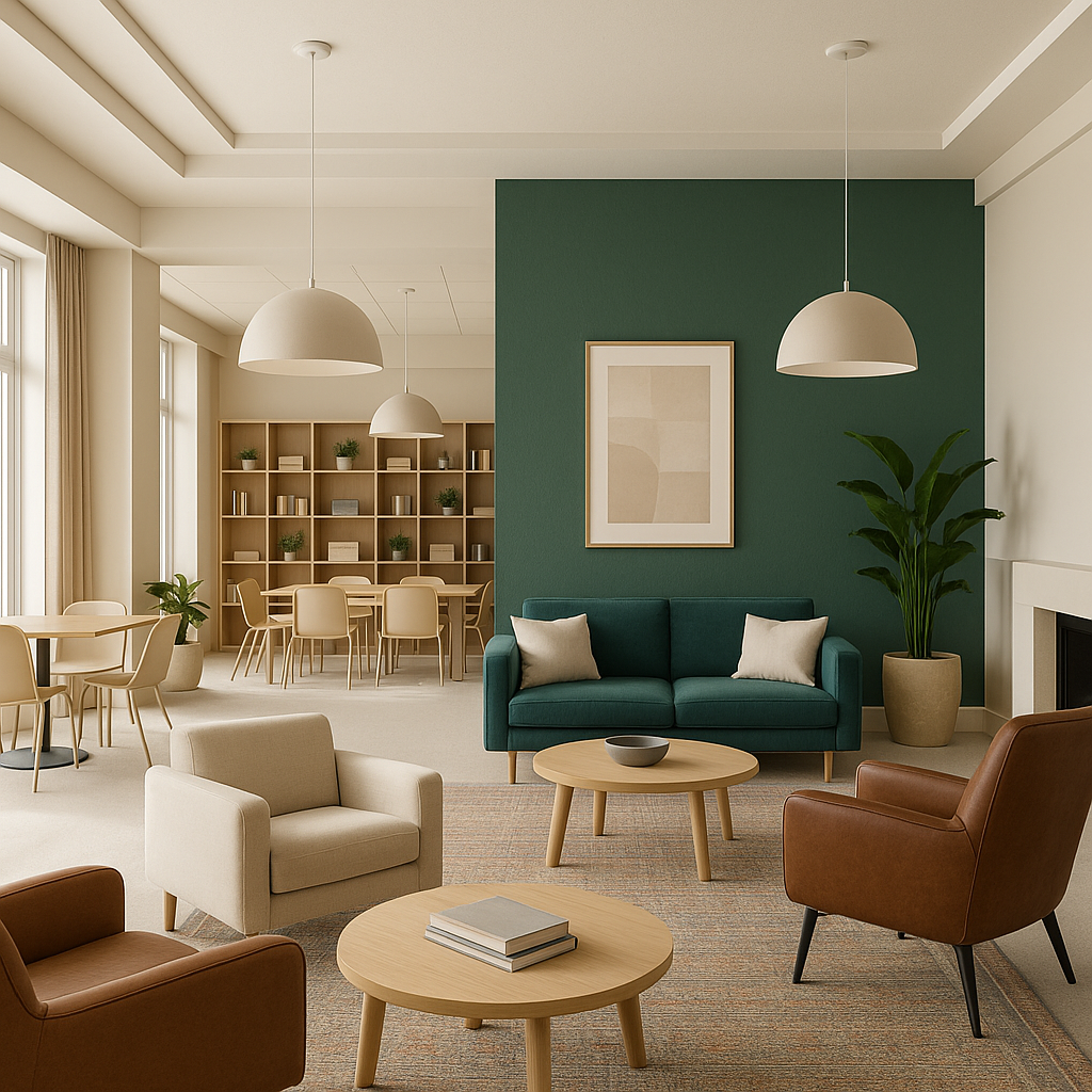
Education Trends for 2026: Focused, Flexible, and Student-Centered
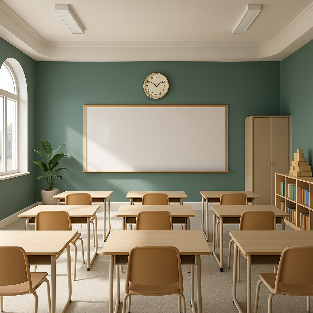
Educational spaces in 2026 are evolving to better support focus, flexibility, and student well-being. Classrooms and learning environments are becoming calmer, more intentional, and less visually overwhelming.
- Cloud Dancer creates bright, open classrooms that feel clean and distraction-free.
- Universal Khaki adds warmth to balance the space and make it more welcoming.
- Hidden Gem works as an accent color for collaboration zones and breakout areas.
In 2026, learning environments are designed to feel supportive, adaptable, and aligned with how students actually learn.
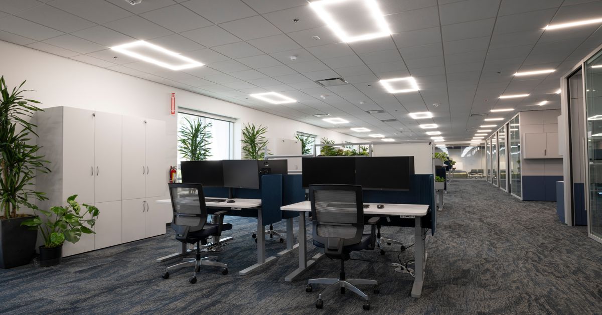
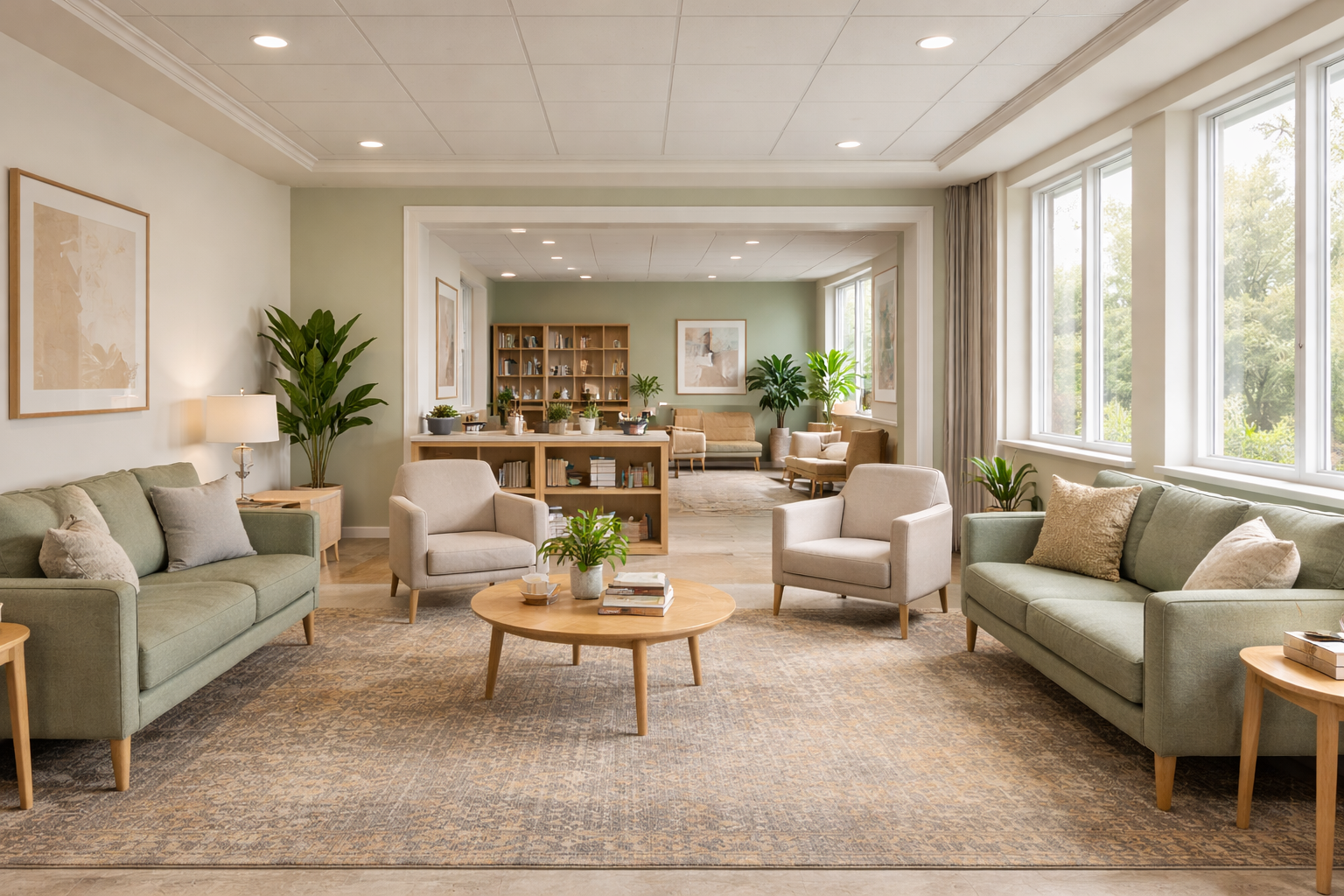
Workplace Trends for 2026: Warmth, Connection, and Flexibility
Workplace design in 2026 continues to move away from rigid layouts and toward spaces that feel inviting, flexible, and purpose-driven.
- Cloud Dancer provides a clean, light foundation.
- Universal Khaki brings warmth and balance.
- Hidden Gem adds depth and personality to shared spaces.
The most successful workplaces are designed to feel intentional, human, and adaptable—and color is doing more of that work than ever before.