The Role of Color in Healthcare Furniture Design
The physical space of a healthcare environment directly impacts patient experience and well-being. Functionality and ergonomics are paramount, but don’t underestimate the role of color in healthcare furniture design. The right color palette can soothe anxious patients, guide visitors, and even enhance staff productivity.
Color can transform a clinical setting from a source of stress into a place of comfort and reassurance. It influences perceptions, emotions, and behaviors, making it a powerful tool for any healthcare facility aiming to improve its patient-centric approach. The colors you select for your furniture and decor can foster trust, communicate cleanliness, and project an image of modern, compassionate care. Here’s how a thoughtful color strategy can create a healthcare environment that supports patients and providers effectively.
Creating a Welcoming Atmosphere
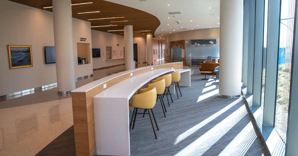
First impressions matter in a healthcare setting. When a patient walks into a facility, their initial feelings can set the tone for their entire visit. The colors used in the entryway and waiting areas are instrumental in portraying a welcoming and calming atmosphere.
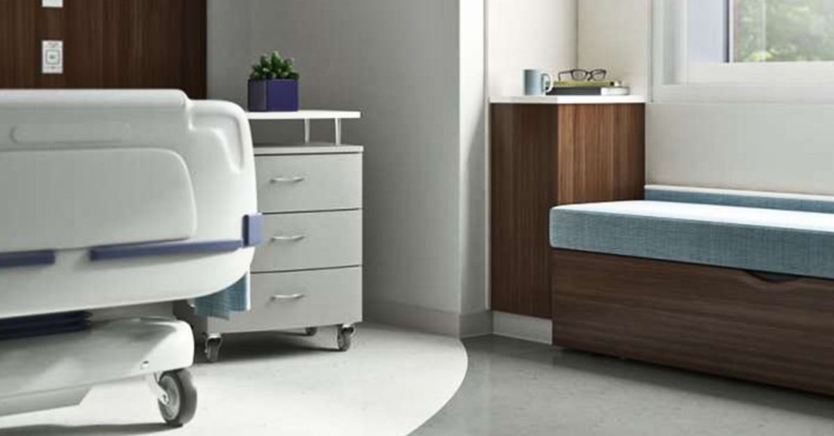
Soft, warm neutrals such as beige, cream, and light gray can make a space feel open and inviting, putting patients at ease. These tones project a sense of stability and comfort, reducing the sterile, intimidating feeling that many associate with medical facilities. Select furniture in these hues to build a foundation of tranquility that alleviates the anxiety often linked with healthcare appointments.
Easing Patient Anxiety
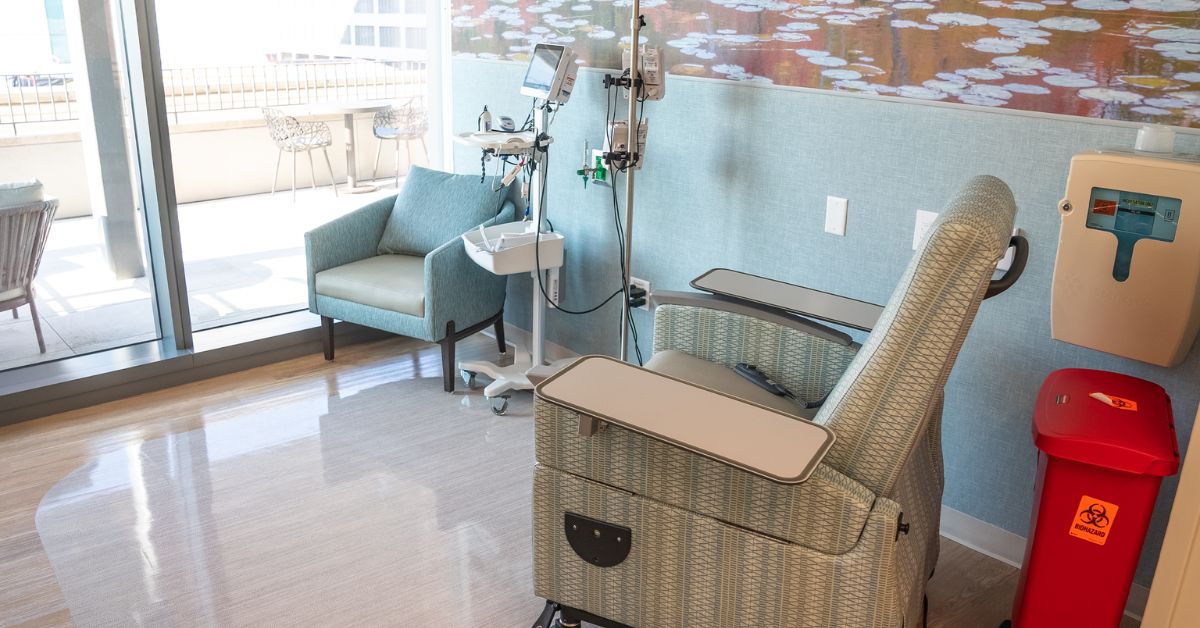
Hospitals and clinics can be stressful environments. The color of the furniture and surrounding decor can either amplify or mitigate this anxiety. Research shows that certain colors have a calming effect on the human psyche. Blues and greens, for instance, are widely recognized for their soothing properties.
Light blue often evokes feelings of serenity and peace, as it’s reminiscent of a clear sky or calm water. Similarly, shades of green connect us to nature and promote a sense of harmony and renewal. Incorporating these colors into seating, privacy screens, and other furniture pieces can lower blood pressure and reduce stress, creating a more therapeutic environment for patients awaiting treatment.
Differentiating Spaces With Wayfinding
Large healthcare facilities can be confusing to navigate, causing frustration for patients and visitors. Color can act as an effective and intuitive wayfinding tool to guide people through complex layouts. You can assign distinct color schemes to different departments or floors to create a visual map that is easy to follow. For example, the pediatrics wing might use bright, playful colors, while the cardiology department could feature calming blues.
Apply this color-coding technique to furniture, signage, and wall accents to provide clear and consistent visual cues that help people orient themselves without constantly asking for directions. This system improves traffic flow and enhances the patient experience by making navigation simple and stress-free.
Enhancing Cleanliness and Hygiene
Cleanliness is essential in healthcare environments. The colors you choose can visually support a facility’s commitment to hygiene. Light, neutral colors, such as white, off-white, and pale gray, create an impression of sterility and order. They also make it easier to spot dirt and spills so that cleaning staff can maintain a high standard of sanitation.
Furniture with smooth, nonporous surfaces in these lighter shades looks clean, and it’s easier to disinfect. While darker colors might hide stains, they can also mask potential hygiene issues. A palette of light, crisp colors communicates transparency and a dedication to maintaining a pristine environment.
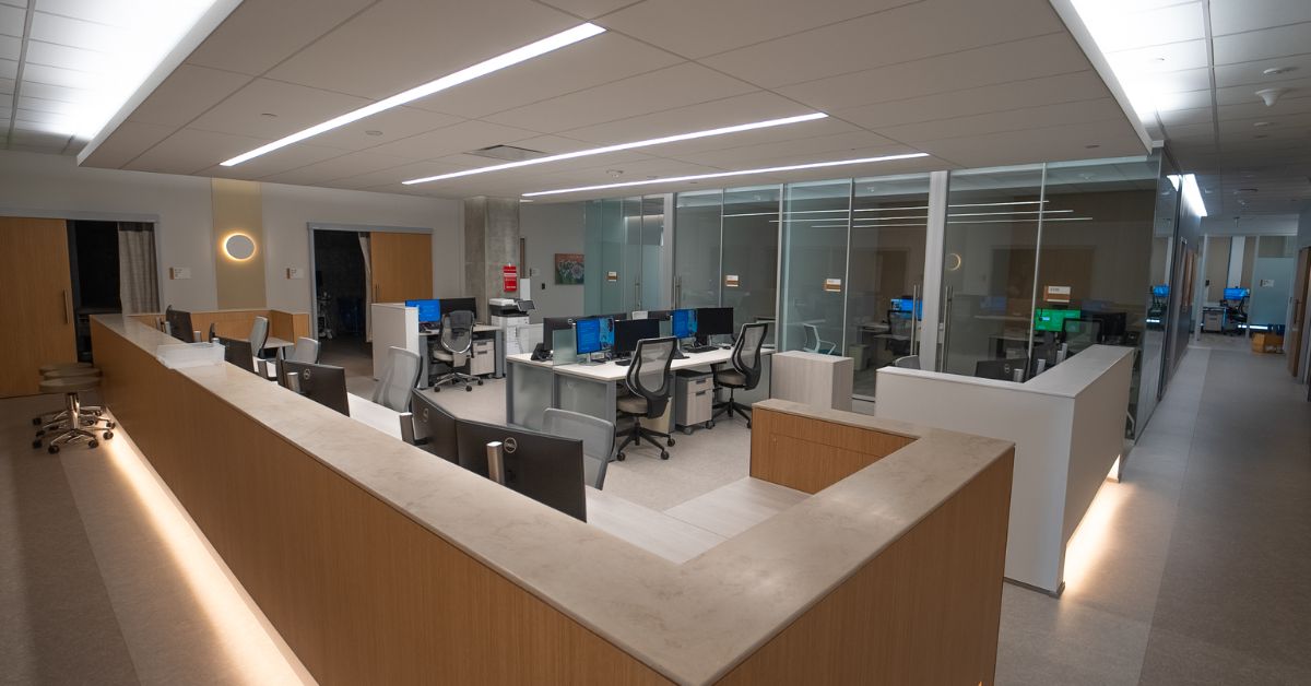
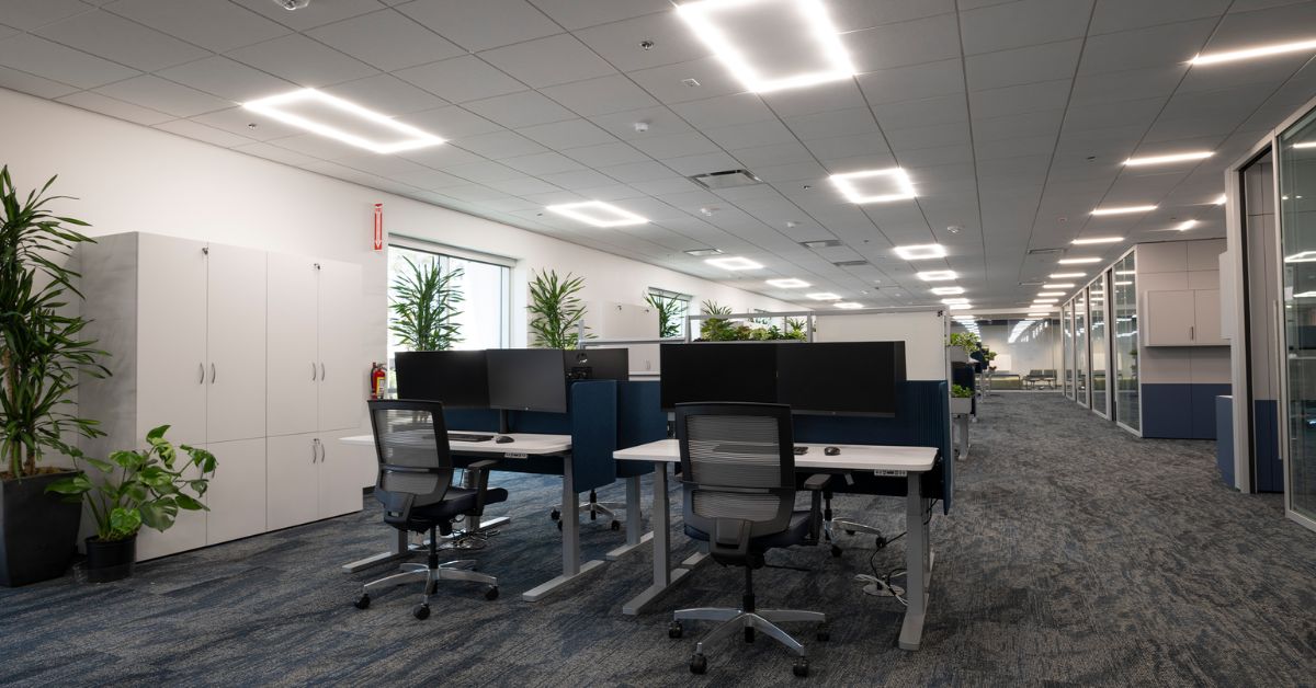
Boosting Staff Morale and Productivity
The design of a healthcare facility doesn’t just affect patients—it also impacts the staff who work there every day. A thoughtfully designed workspace can boost morale, reduce fatigue, and improve productivity. Colors that promote focus and energy, such as soft yellows or orange accents, can be beneficial in administrative areas and break rooms. These energizing hues can stimulate mental activity and foster a positive, collaborative atmosphere.
Incorporating colors that provide a sense of calm and respite into staff-only zones can help employees de-stress during breaks. Comfortable, ergonomic medical reception furniture in soothing colors contributes to a more supportive and efficient work environment.
Aligning With Brand Identity
A healthcare organization’s brand is built on trust, professionalism, and care, and a facility’s colors should reflect this identity. Your color palette can tell a story, whether your brand is associated with innovation, compassion, or community wellness.
A cutting-edge medical tech company might use a palette of sleek grays, whites, and a bold accent color to convey modernity and precision. On the other hand, a community health clinic might opt for warm, earthy tones to project a sense of nurturing and accessibility. Aligning your furniture and decor with your brand colors reinforces your organization’s values and puts forward a cohesive, memorable identity.
Supporting Different Patient Populations
Different patient demographics respond to colors in unique ways. A pediatric clinic, for example, benefits from a vibrant and engaging color palette. Bright yellows, greens, and blues can make the environment feel fun and less intimidating for children. These playful colors distract and entertain young patients, making examinations and treatments a less stressful experience.
Conversely, facilities catering to older adults, such as geriatric centers or assisted living communities, should use colors that are easy on aging eyes. High-contrast color combinations can aid with visibility and depth perception, while soft, muted tones bring about a peaceful and secure atmosphere. Tailoring your color choices to your primary patient population demonstrates a care and consideration that your patients will appreciate.
Using Color in Therapeutic Settings
Color is an important part of the healing process in specialized therapeutic environments, such as mental health facilities or rehabilitation centers. These facilities often apply the principles of color psychology to support therapeutic goals. Here are some examples:
- Green can promote emotional balance and is often used in spaces designed for counseling and group therapy.
- Blue’s calming nature is ideal for quiet rooms or areas where patients need to de-escalate and find tranquility.
- Soft pink has been shown to have a soothing effect and can be used in spaces to reduce aggression and promote a sense of calm.
- Violet can inspire creativity and introspection, making it suitable for art therapy rooms or meditation spaces.
Facility executives can select furniture in these therapeutic shades to design an environment that actively contributes to patient recovery and well-being.
Elevate Your Healthcare Environment
There are many ways to use color in healthcare furniture design to foster an environment that is healing, efficient, and patient-focused. The right colors can transform a cold, clinical space into one that feels warm and welcoming to patients and supports staff performance. Consider leveraging color to improve wayfinding, reinforce cleanliness, and align with your brand. Doing so will demonstrate a commitment to holistic care that will set your facility apart.
If you are ready to revolutionize your healthcare space with innovative, ergonomic, and thoughtfully designed furniture solutions, our team at bluespace interiors is here to help. We are experts in creating transformative environments that enhance well-being and productivity.
Contact us today for a consultation, and let us help you tailor a solution for your success.